
In a world where home decor trends constantly evolve, nothing speaks luxury quite like a bold color palette filled with jewel tones and deep hues.
These vibrant colors can instantly transform any space, making it feel rich and inviting.
From sultry emerald greens to striking sapphire blues, jewel tones offer a unique way to express personality and style, allowing you to create an opulent look that’s truly your own.
In this collection, we’ll explore 25 luxurious color palettes that will inspire you to embrace boldness in your home decor journey.
Contents
- 1. Enchanted Emerald and Gold
- 2. Regal Ruby and Charcoal
- 3. Sapphire Serenity with Cream
- 4. Amethyst Dreams with Soft Lavender
- 5. Turquoise and Espresso Elegance
- 6. Deep Teal and Mustard Delight
- 7. Bountiful Black and Jewel Tones
- 8. Sunset Orange and Deep Plum
- 9. Forest Green and Terracotta
- 10. Warm Coral and Navy
- 11. Charcoal and Dusty Rose
- 12. Chocolate Brown and Mint Green
- 13. Raspberry Pink and Greige
- 14. Bright Yellow and Deep Indigo
- 15. Creamy Beige and Ocean Blue
- 16. Lemon Lime and Soft Gray
- 17. Olive Green and Blush Pink
- 18. Brick Red and Cream
- 19. Magenta and Slate Grey
- 20. Deep Burgundy and Gold
- 21. Indigo and Wheat
- 22. Steel Blue and Copper
- 23. Pistachio and Charcoal
- 24. Champagne and Deep Forest
- 25. Bright Aqua and Earthy Taupe
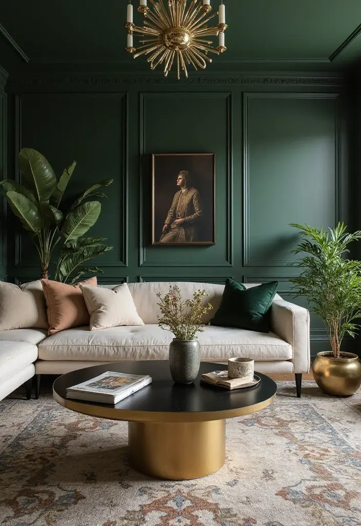
1. Enchanted Emerald and Gold
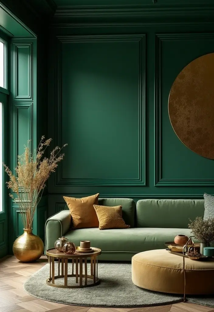
This palette is all about elegance. The deep emerald green paired with shimmering gold creates a sense of luxury that’s hard to beat.
Imagine using emerald green as your primary wall color, highlighting it with gold accents through frames and fixtures. The contrast makes each hue pop, inviting warmth into your space.
Consider adding textures like velvet cushions or a plush area rug in similar green shades to enhance the opulent feel.
Complementary colors like deep navy can add depth, or soft creams can lighten the palette when needed. The overall effect is both dramatic and inviting, making any room feel alive with sophistication.
– Use gold metallics in furniture and decor.
– Incorporate a mix of patterns in cushions and throws.
– Layer different textures for a rich sensory experience.
Elevate your home with bold color palettes! Deep emerald and shimmering gold create a luxurious atmosphere that invites warmth and elegance into your space.
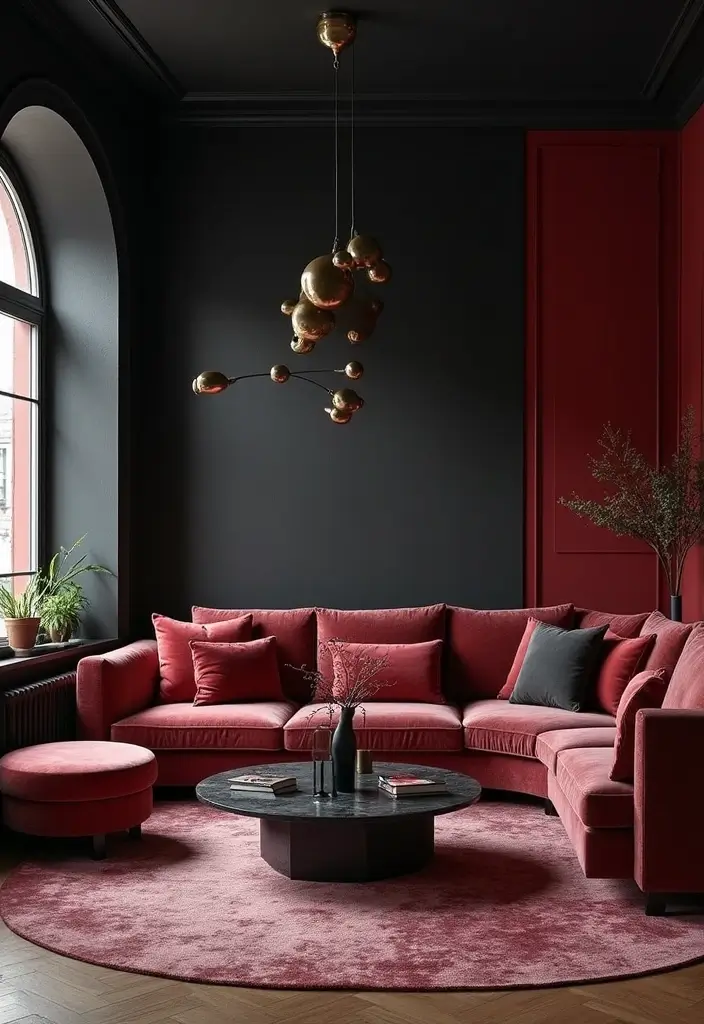
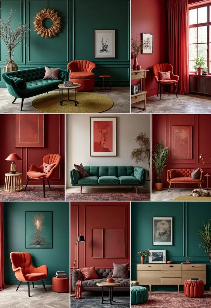
2. Regal Ruby and Charcoal
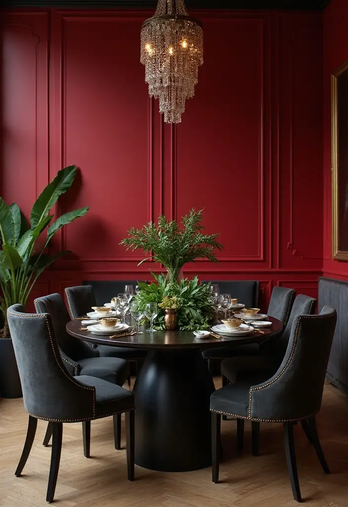
Ruby red is a statement maker! When paired with the deep intensity of charcoal gray, it creates a stunning contrast that feels both modern and classic.
Imagine a feature wall painted in ruby red with sophisticated charcoal furnishings that ground the palette beautifully. Add in metallic elements like brass or silver for a touch of glamour, which harmonizes nicely with the bold colors.
Incorporate artwork or decor items that play off the ruby tones, creating visual interest across the room. To soften the intensity, use lighter shades like soft whites in drapes or accessories, making the room feel balanced yet striking.
– Choose art pieces that echo the ruby and charcoal theme.
– Mix in wood tones for warmth and texture.
– Use layered lighting to highlight the color contrast.
3. Sapphire Serenity with Cream
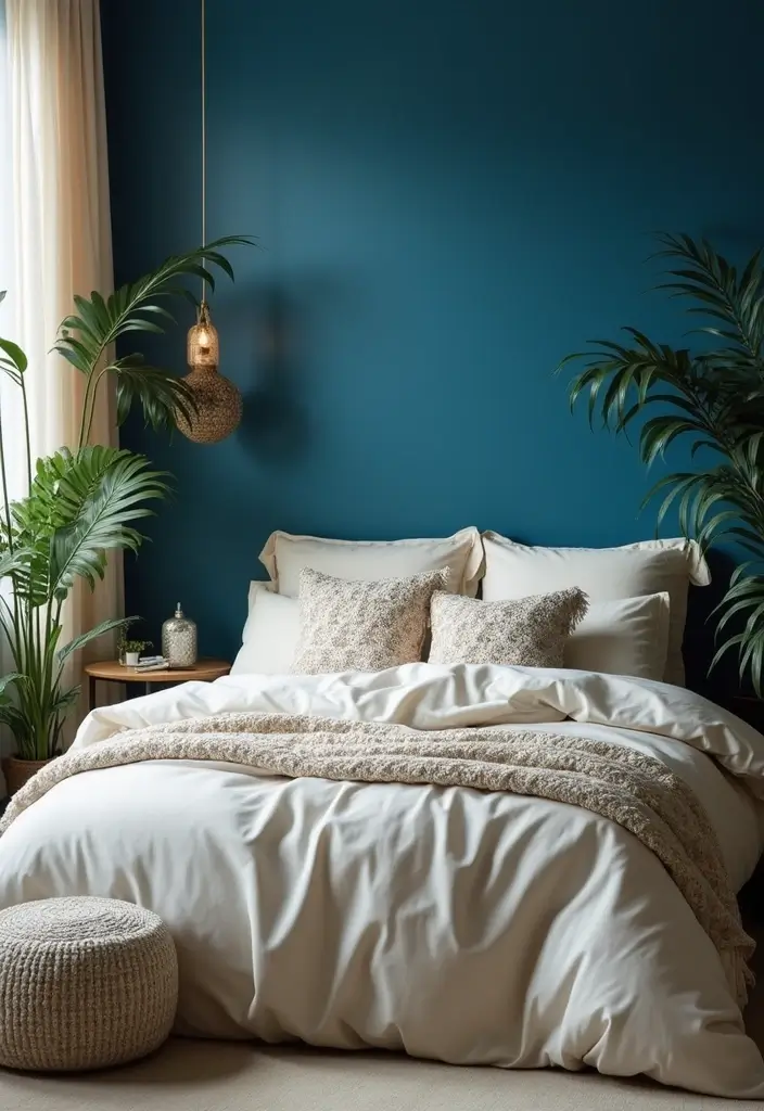
Sapphire blue radiates calm and luxury, especially when combined with soft cream tones. This palette is perfect for creating serene bedroom spaces or cozy reading nooks.
Consider deep sapphire wall colors with creamy white linens and drapes to create a sophisticated yet inviting atmosphere. Adding textures like a plush cream throw or beautiful ceramic vases can enhance the overall aesthetic, making the space feel layered and thoughtful.
Accent pieces in silver or brushed nickel will add a modern twist, tying the look together beautifully. For a personal touch, include artwork that features hints of blue to reinforce the palette cohesively.
– Use varying shades of blue in decor items for depth.
– Incorporate nature-inspired accents like plants or floral arrangements.
– Choose soft lighting to enhance the calm vibe.
Sapphire serenity meets soft cream for a cozy retreat! Elevate your space with bold color palettes that blend luxury and tranquility—perfect for unwinding at the end of the day.
4. Amethyst Dreams with Soft Lavender
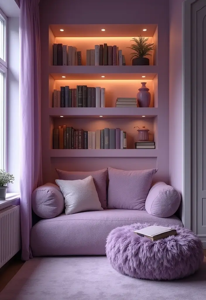
Amethyst is a color that speaks to creativity and luxury. When paired with soft lavender, it creates a dreamy retreat perfect for a reading corner or a cozy bedroom.
Consider painting an accent wall in a rich amethyst while keeping the rest of the room in lighter lavender tones. This contrast can be beautifully complemented with white trim and dark wood furniture for a touch of drama. Layering in different textures, such as soft throws and plush rugs, heightens the cozy vibe while remaining chic.
For a bit of glimmer, incorporate metallics like gold in light fixtures or decorative accents, adding an element of surprise and elegance.
– Use artwork in similar color schemes to tie the room together.
– Incorporate plants to add freshness and life.
– Choose ambient lighting to create a soothing atmosphere.
5. Turquoise and Espresso Elegance
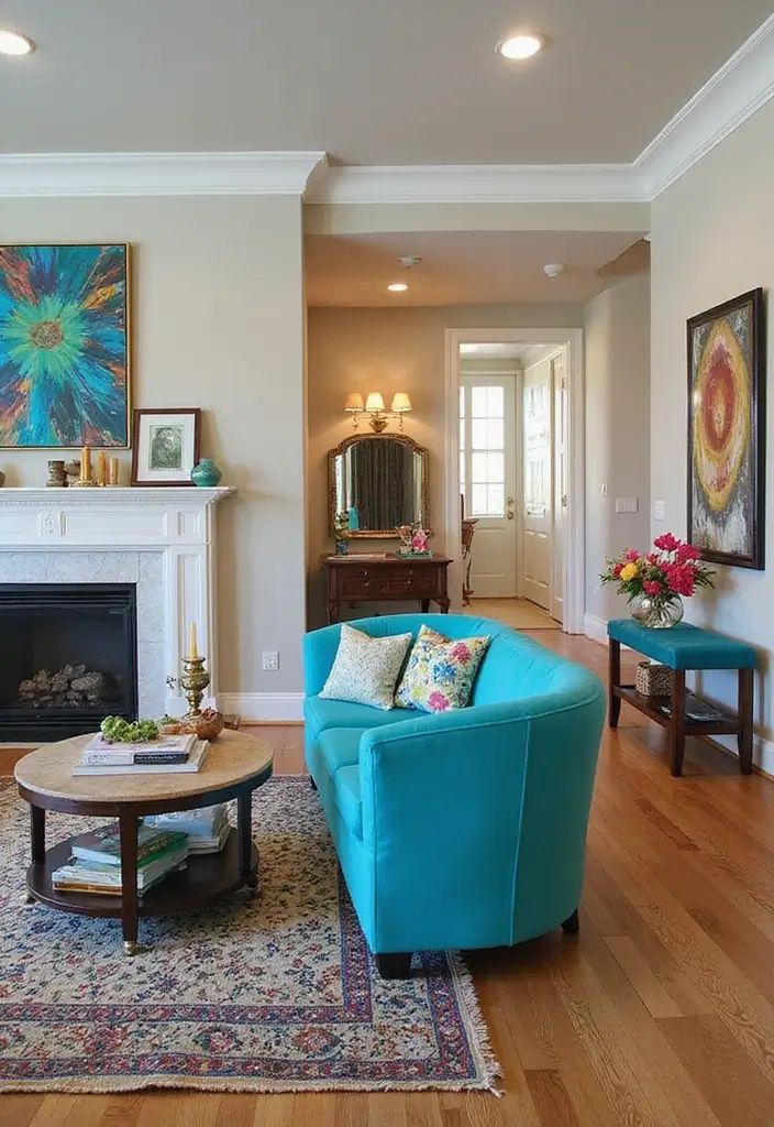
Turquoise is a vibrant and refreshing color that can energize any space. Pairing it with the deep richness of espresso brown creates a captivating juxtaposition.
Turquoise accents, like throw pillows or artwork, can stand out beautifully against dark wood furniture or espresso-painted walls. Consider adding gold or brass fixtures to enrich the palette, which adds an upscale touch. This combination works well in living spaces where you can showcase colorful art and decor items that highlight the turquoise without overwhelming the senses.
– Use varying shades of turquoise for depth.
– Incorporate patterns in textiles to add visual interest.
– Keep the lighting warm to create a welcoming atmosphere.
6. Deep Teal and Mustard Delight
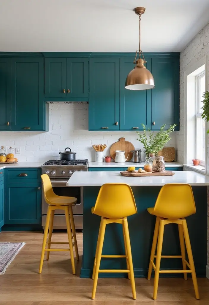
Who says bold can’t be fun? Deep teal combined with mustard yellow creates a playful yet sophisticated atmosphere.
This duo is perfect for spaces like kitchens or home offices where a touch of energy is desired. Picture deep teal walls complemented by mustard accessories, like bar stools or art pieces, creating a lively environment. Incorporate natural wood tones to balance the vibrancy and add warmth. To enhance the playful side, consider geometric patterns in your textiles, such as curtains or cushions, making the room feel dynamic and engaging.
– Use mixed materials like metal and wood for decor.
– Incorporate plants for a touch of nature.
– Choose bold light fixtures that echo the color scheme.
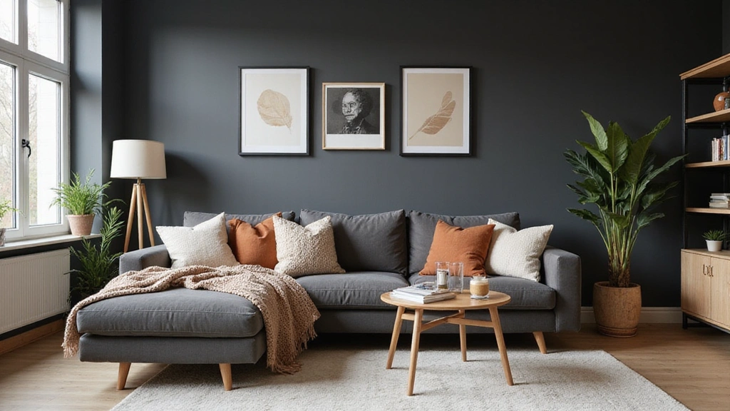
7. Bountiful Black and Jewel Tones
Black is the ultimate backdrop for showcasing jewel tones, creating a space that feels both dramatic and luxurious.
Think accent walls or furniture pieces in black paired with vibrant jewel tone decor, like emerald green vases or ruby red throws. This palette is great for modern spaces, allowing jewel tones to shine brightly against a sophisticated backdrop. Combine metallic accents to amplify the luxury and consider using rich textures, such as velvet or silk, to enhance the opulent feel. The result is a chic, unforgettable interior that exudes confidence and style.
– Use rich textures to create visual layers.
– Incorporate artistic pieces in jewel tones for focal points.
– Keep lighting soft and inviting to create balance.
8. Sunset Orange and Deep Plum
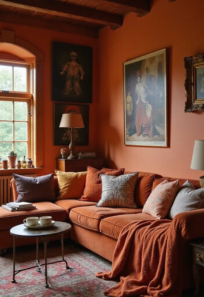
Sunset orange paired with deep plum is an unexpected delight that evokes warmth and comfort. This vibrant palette can create a welcoming atmosphere in any living space.
Consider using sunset orange for your primary accents, like curtains or throw pillows, and deep plum for larger furniture pieces or wall colors. The warm undertones of orange harmonize beautifully with the richness of plum, creating a cozy yet vibrant vintage vibe. Layering in natural wood elements can soften the boldness while adding an organic touch. To bring it all together, consider using metallic accents or artwork that ties the colors together seamlessly.
– Incorporate layered lighting to enhance warmth.
– Use vintage-inspired decor pieces to add character.
– Blend in textiles that feature both colors for continuity.
9. Forest Green and Terracotta
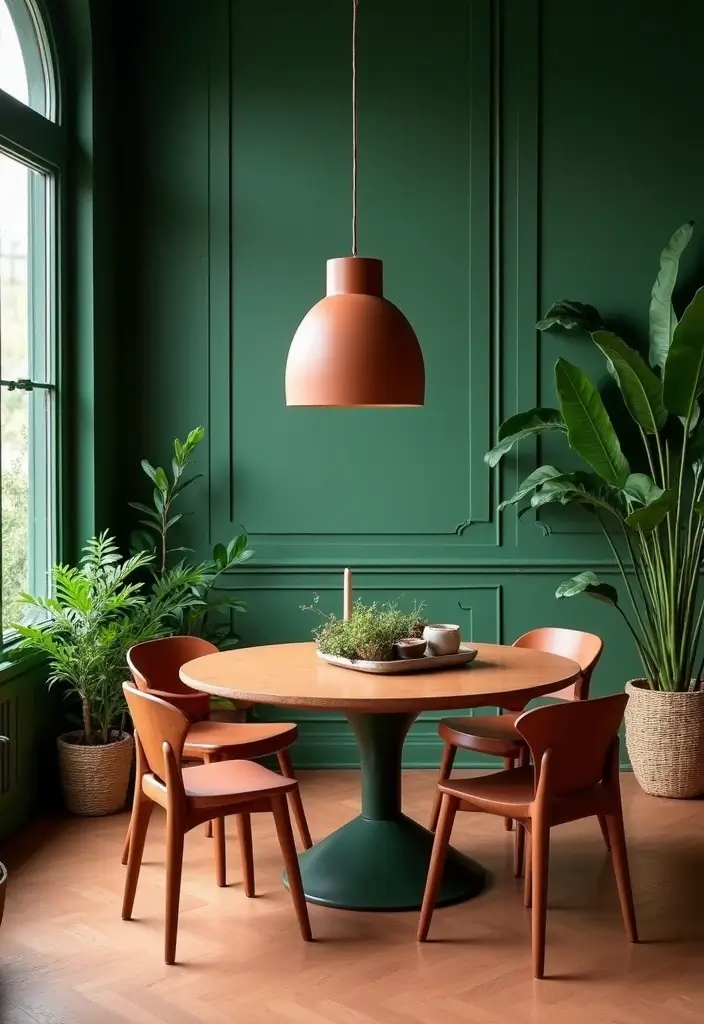
Forest green is a classic and grounding color that pairs beautifully with the earthy tones of terracotta. This palette brings a touch of the outdoors inside, creating a calming, nature-inspired vibe.
Imagine using forest green as the dominant wall color, while terracotta accents appear in vases or terracotta pots. The combination feels fresh and organic, perfect for spaces like dining areas or home offices. Incorporate natural textures through wooden furniture and woven textiles to enhance the earthy appeal. This palette is great for those looking to cultivate a serene and harmonious atmosphere.
– Use natural fibers in rugs and curtains for warmth.
– Incorporate plant life for an organic feel.
– Keep the decor minimal to highlight the colors.
10. Warm Coral and Navy
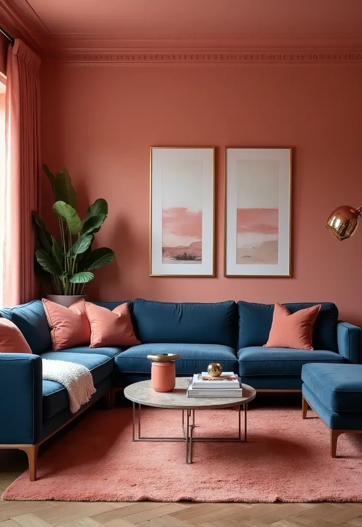
Warm coral combined with navy blue creates a delightful balance of warmth and depth, perfect for modern spaces.
Use coral as an accent color through cushions, art, or a feature wall, while allowing navy to dominate larger areas, like furniture or cabinetry. This pairing can evoke a cozy yet stylish appeal, making it ideal for living rooms or bedrooms. Incorporate metallics like gold or brass to add a touch of glamour and tie the look together. Soft lighting can enhance the warmth of coral, making the space feel inviting and chic.
– Mix patterns in your textiles for added interest.
– Use wooden elements to create warmth.
– Choose art pieces that incorporate both colors for cohesion.
You might also like

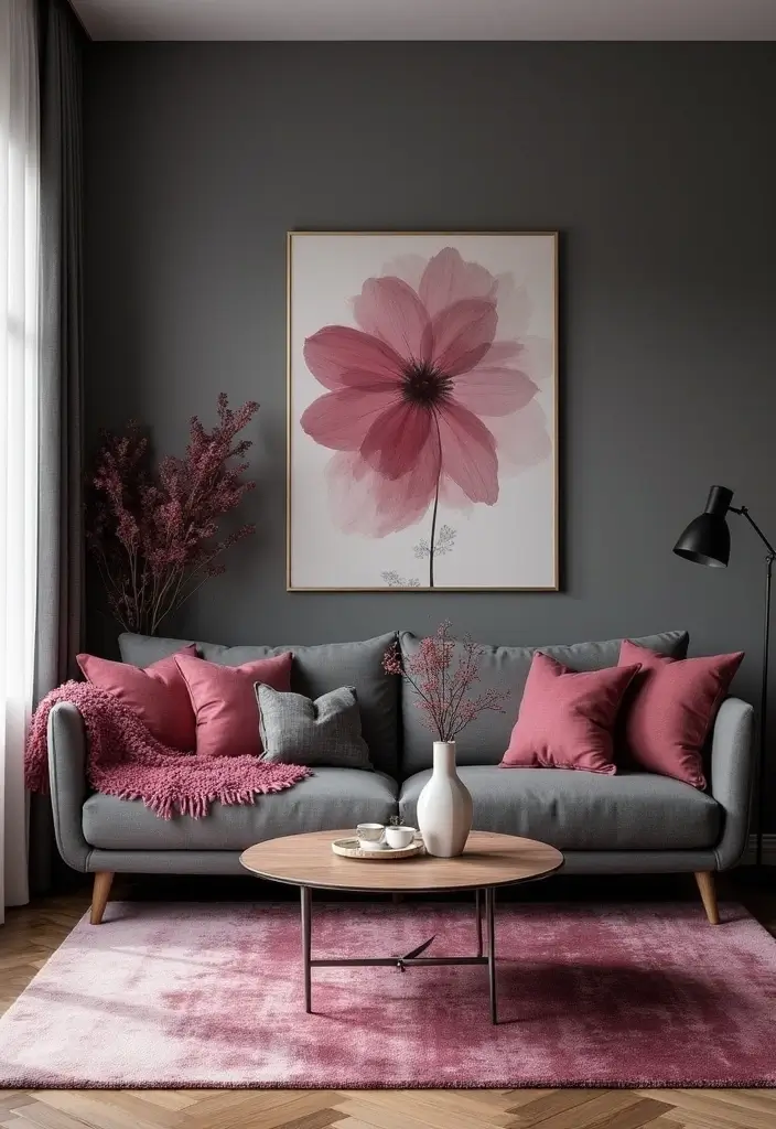
11. Charcoal and Dusty Rose
Dusty rose is a soft, romantic shade that pairs beautifully with the seriousness of charcoal. This palette strikes the perfect balance between soft and strong, making it ideal for bedroom retreats or chic living spaces.
Consider charcoal walls to ground the room, with dusty rose accents in bedding, curtains, or art. This combination promotes serenity while adding a touch of elegance. Incorporate natural materials like wood or linen to create an inviting, lived-in feel. For a pop of surprise, add metallic accents, like brushed gold or silver, which can elevate the overall look.
– Use layered textiles to soften the contrast.
– Include greenery to enhance freshness.
– Opt for ambient lighting to promote a cozy atmosphere.
Embrace the elegance of charcoal and dusty rose – a bold color palette that marries strength and softness, transforming your space into a serene sanctuary with a touch of romance!
12. Chocolate Brown and Mint Green
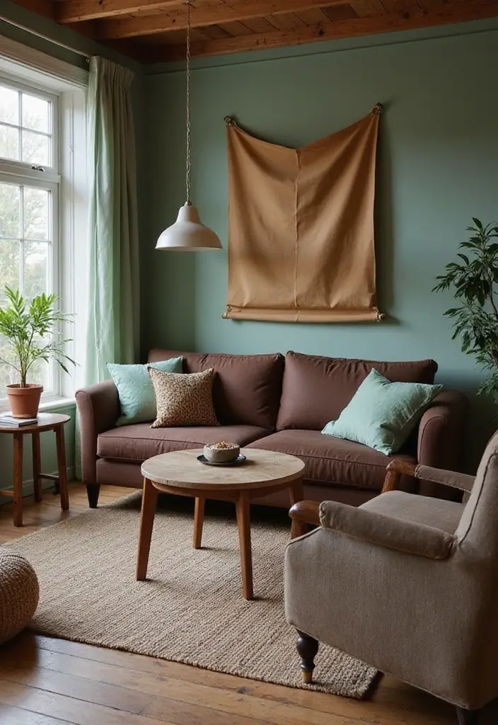
Chocolate brown offers a warm, inviting backdrop, while mint green provides a refreshing pop of color. This palette is often underestimated but creates a cozy and cheerful environment.
Use chocolate as the primary color in furniture or wall accents, allowing mint green to shine through in accessories, artwork, or smaller furniture pieces. This visual contrast creates interest while maintaining a cohesive feel. Adding natural elements can enhance comfort, making it perfect for spaces where family gathers. The combination is nostalgic yet modern, perfect for casual yet stylish decor.
– Layer in different materials like leather and textiles.
– Incorporate plants to bring life into the space.
– Use soft, inviting lighting to create warmth.
13. Raspberry Pink and Greige
Raspberry pink is a bold, spirited color that can energize any space, especially when paired with the neutral tone of greige (a blend of gray and beige). This palette is fantastic for creating lively interiors that feel fresh and youthful.
Use raspberry pink for accent walls or larger pieces of furniture, while greige serves as a calming counterbalance in textiles or decor. This combination can evoke a sense of playfulness without overwhelming the senses. Incorporate natural elements or light wood to maintain a balanced feel. Don’t hesitate to add layered textures for added interest!
– Mix patterns in fabrics for a dynamic look.
– Use light fixtures that create interesting shadows and shapes.
– Choose artwork that incorporates both colors to tie the room together.
14. Bright Yellow and Deep Indigo
Bright yellow brings warmth and energy, while deep indigo provides grounding depth. Together, they create a dynamic and eye-catching palette perfect for energizing spaces like kitchens or creative studios.
Consider using bright yellow as a feature wall or in smaller accent pieces, with deep indigo for larger furniture pieces, providing a bold yet balanced look. This combination exudes creativity and can be enhanced with graphic patterns or playful decor items. Natural wood tones can provide warmth and texture, grounding the vibrant colors while keeping the energy high.
– Use bright artwork to pull the colors together.
– Incorporate functional decor pieces that showcase both colors.
– Choose light sources that enhance the vibrancy of yellow.
Energize your home with bright yellow and deep indigo! This bold color palette not only sparks creativity but also creates a warm, inviting atmosphere. Perfect for kitchens and studios that thrive on inspiration!
15. Creamy Beige and Ocean Blue
Creamy beige serves as a soft, neutral foundation while ocean blue brings in refreshing vibrancy, creating a palette that feels airy and serene. This combination is perfect for coastal-inspired decor or relaxing spaces.
Use beige on larger surfaces, like walls or sofas, and add depth with ocean blue accents through cushions, art, or decor. The contrast creates a tranquil ambiance perfect for unwinding. Incorporate natural textures, such as rattan or light wood, to enhance the coastal vibe. Additionally, soft lighting can enhance the calming effects of this color scheme.
– Use layered textiles in both colors for depth.
– Incorporate seashell or ocean-inspired decor accents.
– Choose light fixtures that mimic natural light.
16. Lemon Lime and Soft Gray
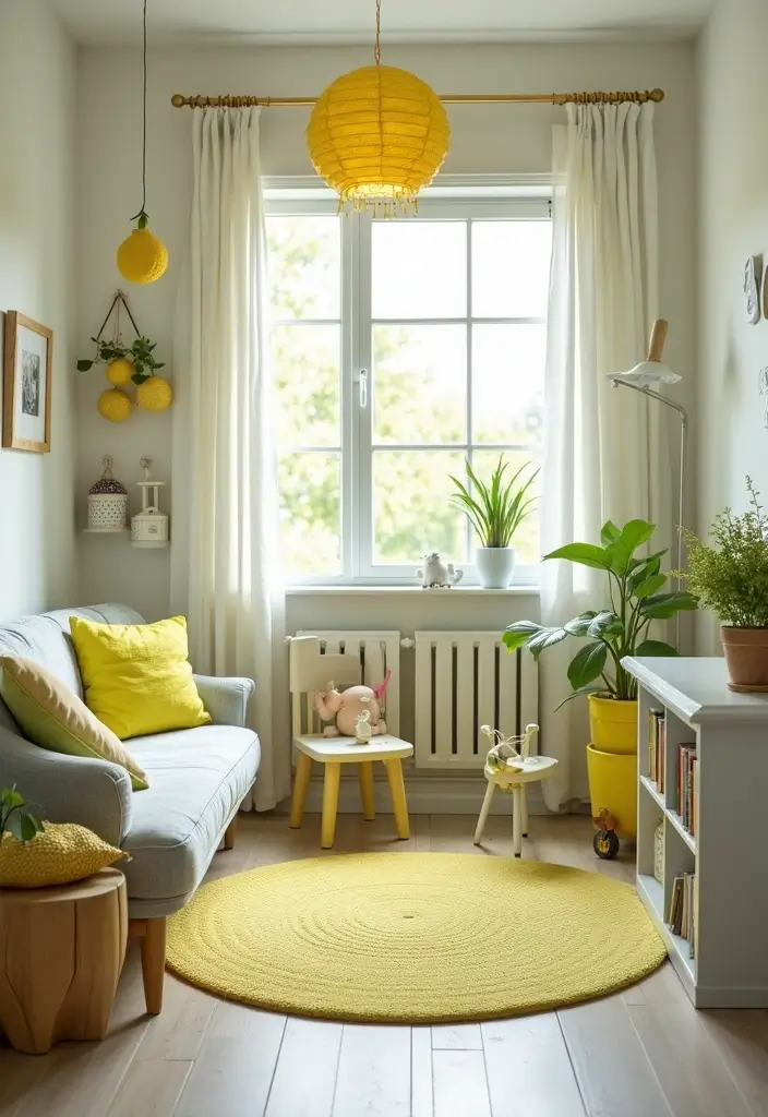
Lemon lime brings a burst of freshness, while soft gray adds sophistication and balance. This palette is perfect for modern homes looking to inject a playful vibe without being overwhelming.
Use lemon lime for accent walls or decorative elements, paired with soft gray in larger furniture pieces or textiles. The combination is vibrant yet refined, making it suitable for spaces like kids’ playrooms, kitchens, or contemporary living areas. Layering in textured elements can increase the charm while maintaining a chic aesthetic. Don’t forget to add personal touches that reflect your style!
– Consider graphic patterns that play off both colors.
– Use playful lighting fixtures to emphasize the brightness.
– Incorporate greenery to enhance the liveliness of the palette.
17. Olive Green and Blush Pink
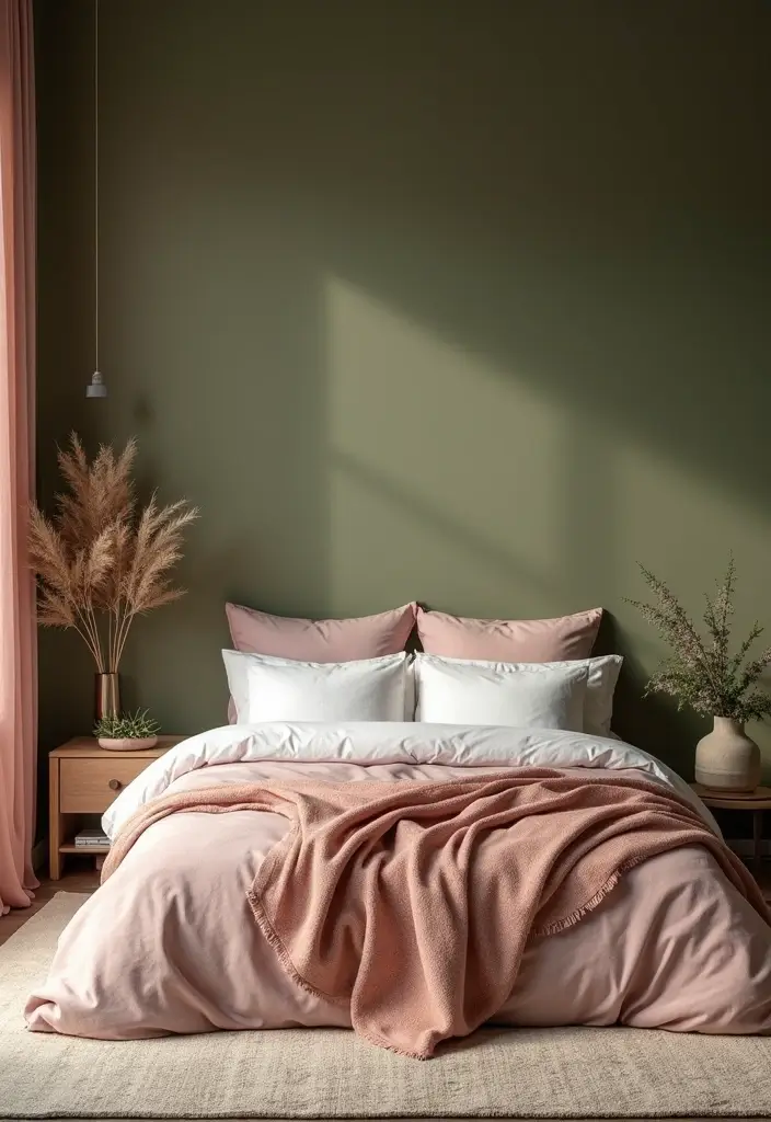
Olive green offers an organic, earthy feel, while blush pink adds a soft, romantic touch. Together, they create a serene and elegant palette perfect for bedrooms or lounges.
Imagine olive green walls paired with blush pink textiles, such as cushions or throws. This combination can evoke tranquility and warmth, making any space feel inviting. Incorporate natural wood elements to enhance the organic vibe and consider metallic accents to add a touch of finesse. The result is a sophisticated look that balances boldness with softness.
– Use layered fabrics to create depth and comfort.
– Incorporate artwork that blends both colors for cohesion.
– Choose soft lighting to enhance the romantic atmosphere.
18. Brick Red and Cream
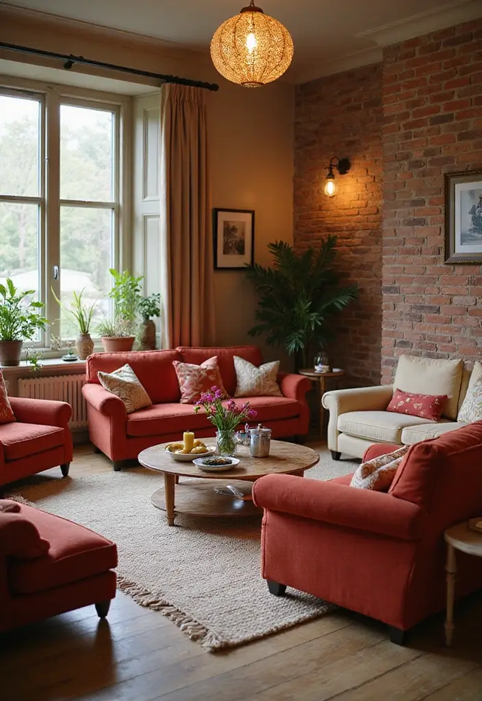
Brick red provides warmth and depth, while cream softens the richness, creating a cozy and inviting atmosphere perfect for family spaces.
Consider using brick red for statement pieces, such as sofas or an accent wall, complemented by cream in your textiles or smaller decor items. This pairing creates a harmonious balance that promotes a comforting vibe. Add natural elements like wood or rattan to further enhance the coziness and warmth of the palette. Layering in different patterns can also bring visual interest into the mix.
– Use warm, ambient lighting to create a welcoming ambiance.
– Incorporate family photos or art in complementary colors.
– Mix textures in cushions and rugs for depth.
You Might Also Like
19. Magenta and Slate Grey
Magenta packs a punch when paired with slate grey, offering a modern and chic color palette that’s perfect for contemporary spaces.
Consider using magenta for impactful decor items or an accent wall while keeping slate grey as a grounding color for furniture. This striking contrast can create an edgy atmosphere while remaining elegant. Incorporate metallic touches, like chrome or silver, for a touch of sophisticated shine. To soften the boldness, layer in softer textures through cushions and rugs.
– Use geometric patterns to enhance the modern look.
– Choose artwork that incorporates both colors for cohesion.
– Use adjustable lighting to create mood and depth.
20. Deep Burgundy and Gold
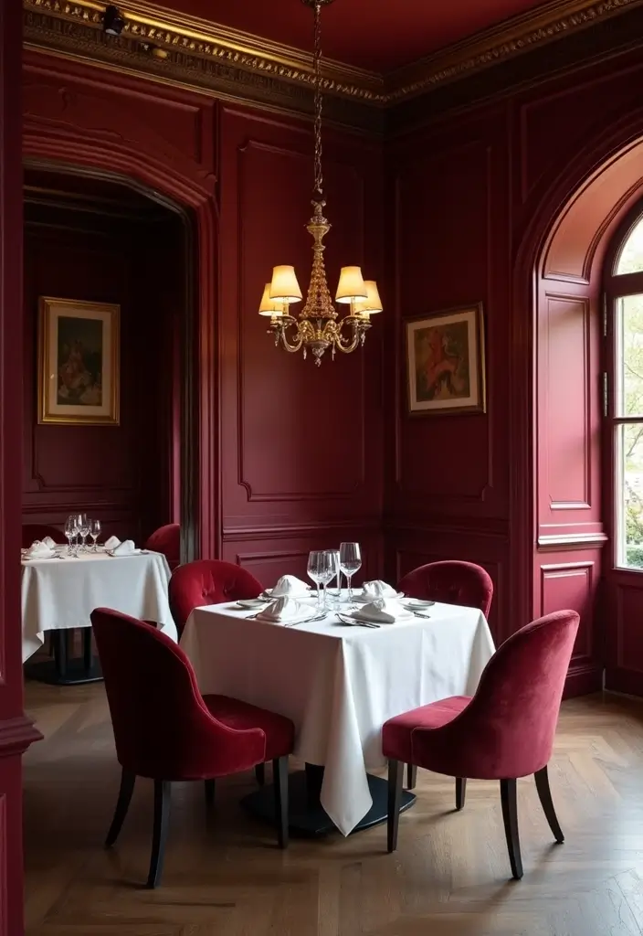
Deep burgundy is rich and luxurious, especially when paired with gold accents. This palette epitomizes opulence and is perfect for formal spaces like dining rooms or sophisticated lounges.
Consider using deep burgundy on walls or larger furniture items, while incorporating gold in lighting fixtures, cutlery, or wall art. This pairing creates a warm and inviting space that feels regal and elegant. Layering in rich textures, such as velvet or silk, can enhance the luxurious feel, making the room feel sumptuous and inviting.
– Use elegant table settings to showcase the color scheme.
– Incorporate mirrored surfaces to reflect light and add dimension.
– Choose soft lighting to enhance the warm atmosphere.
21. Indigo and Wheat

Indigo is a classic color with a cool, calming effect that pairs beautifully with the warm tones of wheat. This palette is perfect for creating serene and balanced spaces.
Think of using indigo for larger elements, like walls or sofas, while incorporating wheat tones in textiles or decor. This combination creates a lovely contrast that feels both comfortable and stylish. Layering natural elements, such as rattan or wood, can enhance the warm, inviting vibe. The key is to keep the décor minimal to allow the colors to shine.
– Use nature-inspired decor pieces for added warmth.
– Incorporate greenery to enhance the cozy atmosphere.
– Soft lighting can make the space feel even more inviting.
22. Steel Blue and Copper
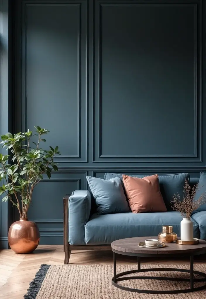
Steel blue is cool and sophisticated, while copper adds warmth and a touch of glamour. Together, this palette creates a modern look that feels luxurious and stylish.
Consider using steel blue for major elements, like walls or furniture, and accenting with copper through light fixtures or decor items. This pairing creates a chic and contemporary atmosphere, perfect for stylish spaces. Layering in different textures, such as leather or soft fabrics, can add depth and interest to the overall design. Keep the decor sleek to maintain an elegant feel.
– Incorporate artwork that complements both colors.
– Use warm lighting to highlight the copper accents.
– Opt for minimalistic decor to keep the focus on the colors.
23. Pistachio and Charcoal
Pistachio is a refreshing and soft color, providing a lovely contrast against the deep intensity of charcoal. This palette is perfect for modern, relaxed spaces that want a touch of freshness.
Think of using charcoal for larger furniture or walls, where pistachio can shine through in smaller textiles or decor items. This balance creates an inviting atmosphere that feels airy and open. Layering in natural textures can enhance the overall aesthetic, making the space feel grounded yet stylish. To finish it off, consider using light fixtures that diffuse warmth to create a cozy ambiance.
– Incorporate greenery to enhance the freshness.
– Use textured rugs to add comfort and coziness.
– Choose wall art that features both colors for cohesion.
24. Champagne and Deep Forest
Champagne is a soft, luxurious color that pairs beautifully with the richness of deep forest green. This palette is perfect for creating a sophisticated and elegant atmosphere.
Consider using deep forest green for your primary color, whether it be on walls or large furniture pieces, while champagne can be used for textiles and decor items. This combination promotes a sense of calm while still feeling upscale. Layering in metallics will add an element of surprise, making every detail feel carefully curated. The key is in choosing the right balance between soft and strong.
– Use luxurious fabrics in pillows and throws for added texture.
– Incorporate art that features both colors for harmony.
– Opt for warm lighting to enhance the elegance.
25. Bright Aqua and Earthy Taupe
Bright aqua brings a refreshing energy to earthy taupe, creating a light, breezy feeling perfect for coastal or eclectic spaces.
Use bright aqua as a fun accent color on walls or furniture while allowing taupe to ground the look as a base color. This combination is perfect for spaces that want to feel welcoming and airy. Layering textures, like woven fabrics or natural materials, can enhance the freshness of the palette while maintaining warmth. This design flows effortlessly into any style, making it easy to incorporate personal touches.
– Use playful decor items that showcase both colors.
– Layer lighting to enhance the bright aqua without overwhelming.
– Incorporate natural elements like driftwood or seashells for a beachy vibe.
Conclusion
Embracing bold color palettes filled with jewel tones and deep hues can dramatically elevate your home decor, adding a sense of luxury and personality.
Each of these palettes brings unique character, allowing you to craft spaces that reflect your individuality and style.
As you experiment with these color combinations, let your creativity shine and create a home that is not only beautiful but also truly yours.
Frequently Asked Questions
What Are Jewel Tones and Why Are They Popular in Home Decor?
Jewel tones are rich, vibrant colors inspired by precious gemstones, like emerald, ruby, and sapphire.
These bold hues bring a sense of luxury and opulence to home decor, making them a popular choice for creating striking and elegant spaces. They can instantly transform a room, adding depth and character that lighter colors often lack.
How Can I Incorporate Bold Color Palettes into My Home Without Overwhelming the Space?
Incorporating bold color palettes can be done thoughtfully! Start with accent walls or statement pieces, like rugs or cushions, to introduce jewel tones gradually.
Mix these colors with neutral shades to balance the overall look. For example, pairing a deep ruby red with soft creams can create a stunning yet inviting atmosphere.
What Are Some Tips for Choosing the Right Jewel Tone for My Space?
When selecting a jewel tone, consider the lighting in your space. Natural light can enhance the vibrancy of colors, while dim lighting might soften them. Test paint samples on your walls to see how they look at different times of the day.
Also, think about how the chosen color will complement existing furniture and decor items to ensure a cohesive look.
Can Bold Color Palettes Work in Small Spaces?
Absolutely! Bold color palettes can work wonders in small spaces. Just remember to use these colors wisely. Opt for one or two accent walls rather than painting the entire room in a deep hue.
Incorporate jewel tones through accessories like pillows, artwork, or decorative items. This approach adds character without making the space feel cramped.
How Do I Maintain a Luxurious Feel While Using Bold Colors?
To maintain a luxurious feel with bold colors, focus on texture and materials. Incorporate plush fabrics, metallic accents, and high-quality finishes to elevate the look.
Pair jewel tones with elegant furnishings and accessories to enhance the opulent atmosphere. For example, combining deep emerald green with gold trim can create a sophisticated and luxurious vibe in your home.
Related Topics
bold color palettes
jewel tones
luxury home decor
deep hues
color combinations
interior design
modern decor
color trends
elegant aesthetics
serene spaces
vibrant interiors
sophisticated palettes


